About a year ago we incorporated a new type of feature into one of our models used for recommending content items to our users. I’m talking about the thumbnail of the content item:

Up until that point we used the item’s title and metadata features. The title is easier to work with compared to the thumbnail — machine learning wise.
Our model has matured and it was time to add the thumbnail to the party. This decision was the first step towards a horrible bias introduced into our train-test split procedure. Let me unfold the story...
Setting the scene
From our experience it’s hard to incorporate multiple types of features into a unified model. So we decided to take baby steps, and add the thumbnail to a model that uses only one feature — the title.
There’s one thing you need to take into account when working with these two features, and that’s data leakage. When working with the title only, you can naively split your dataset into train-test randomly — after removing items with the same title. However, you can’t apply random split when you work with both the title and the thumbnail. That’s because many items share the same thumbnail or title. Stock photos are a good example for shared thumbnails across different items. Thus, a model that memorizes titles/thumbnails it encountered in the training set might have a good performance on the test set, while not doing a good job at generalization.
The solution? We should split the dataset so that each thumbnail appears either in train or test, but not both. Same goes for the title.
First attempt
Well, that sounds simple. Let’s start with the simplest implementation. We’ll mark all the rows in the dataset as “train”. Then, we’ll iteratively convert rows into “test” until we get the desired split, let’s say 80%-20%. How is the conversion done? At each step of the loop we’ll pick a random “train” row and mark it for conversion. Before converting, we’ll inspect all of the rows that have the same title/thumbnail, and mark them as well. We’ll continue doing so until there are no more rows that we can mark. Finally, we’ll convert the marked group into “test”.
And then things escalated
At first sight nothing seems wrong with the naive solution. Each thumbnail/title appears either in train or in test. So what seems to be the problem?
First I’ll show you the symptoms of the problem. In order to be able to compare
the title-only model to the model that also uses the thumbnail, we used the new
split for the title-only model too. It shouldn’t really make an impact on it’s
performance, right? But then we got the following results:
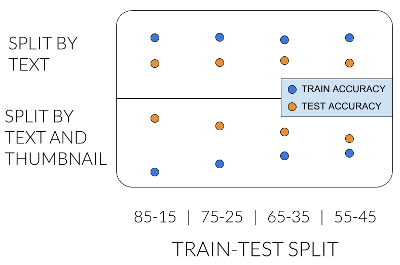
In the top row we see what we already know: the title-only model has higher accuracy on train set, and accuracy isn’t significantly affected by the ratio of the split.
The problem pops up in the bottom row, where we apply the new split method. We expected to see similar results, but the title-only model was better on test. What?... It shouldn’t be like that. Additionally, the performance is greatly affected by the ratio. Something is suspicious...

So where does the problem lurk?
You can think of our dataset as a bipartite graph, where one side is the
thumbnails, and the other is the titles. There is an edge between a thumbnail
and a title if there is an item with that thumbnail and title.

What we effectively did in our new split is making sure each connected component resides in its entirety either in train or test set.
It turns out that the split is biased. It tends to select big components for the test set. Say the test set should contain 15% of the rows. You’d expect it to contain 15% of the components, but what we got was 4%.

Second try
What was the problem with what we did? When you randomly sample a row, the probability of getting a row from a specific component is proportional to the component’s size. Therefore, the test set ended up with a small number of big components. It may be counterintuitive, but here’s a code snippet you can try to experience it yourself:
import numpy as np
import matplotlib.pyplot as plt

def train_test_split(component_sizes, test_size):
  train = component_sizes
  test = []
  while sum(test) < test_size:
    convert = np.random.choice(range(len(train)),
                               p=train.astype('float') / sum(train))
    test.append(train[convert])
    train = np.delete(train, convert)
  return train, test

component_sizes = np.array(range(1, 10000))
test_size = int(sum(component_sizes) * 0.5)

train, test = train_test_split(component_sizes, test_size)
plt.hist([train, test], label=['train', 'test'], bins=30)
plt.title('Distribution of sizes of components', fontsize=20)
plt.xlabel('component size', fontsize=16)
plt.legend(fontsize=14)
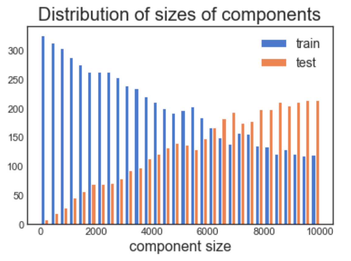
The components size distribution is different between the train and test set.
Now that we formalized better what we were doing by means of bipartite graph, we can implement the split by randomly sampling connected components, instead of randomly sampling rows. Doing so, each component gets the same probability of being selected for the test set.
Key takeaway
The way you split your dataset into train-test is crucial for the research phase of a project. While researching, you spend a significant amount of your time on looking at the performance over the test set. It’s not always straightforward to construct the test set so that it’s representative of what happens at inference time.
Take for example the task of recommending an item to a user: you can either recommend a completely new item or an item that has been shown to other users in the past. Both are important.
In order to understand how the model is doing offline in the research phase, you’ll have to construct a test set that contains both completely new items, and items that appear in the train set. What is the right proportion? Hard to say... I guess it can be a topic for another post on another day 🙂
Originally published by me at engineering.taboola.com.
Comments !